NSC ACADEMIC CONFERENCE
Overview
To celebrate the 70th anniversary of John Steinbeck’s seminal novel East of Eden, the National Steinbeck Center hosted an academic conference to share various perspectives and research analyzing the novel’s place in today’s world. This conference featured short lectures and panel discussions from literary scholars and graduate students.
Client + Duration
The National Steinbeck Center; 5 months
Role
As the Marketing and Communications intern at the National Steinbeck Center my main role was to develop the upcoming academic conference's visual identity. This included creative direction for conference, visual identity, production of print/social media assets, and marketing strategy.
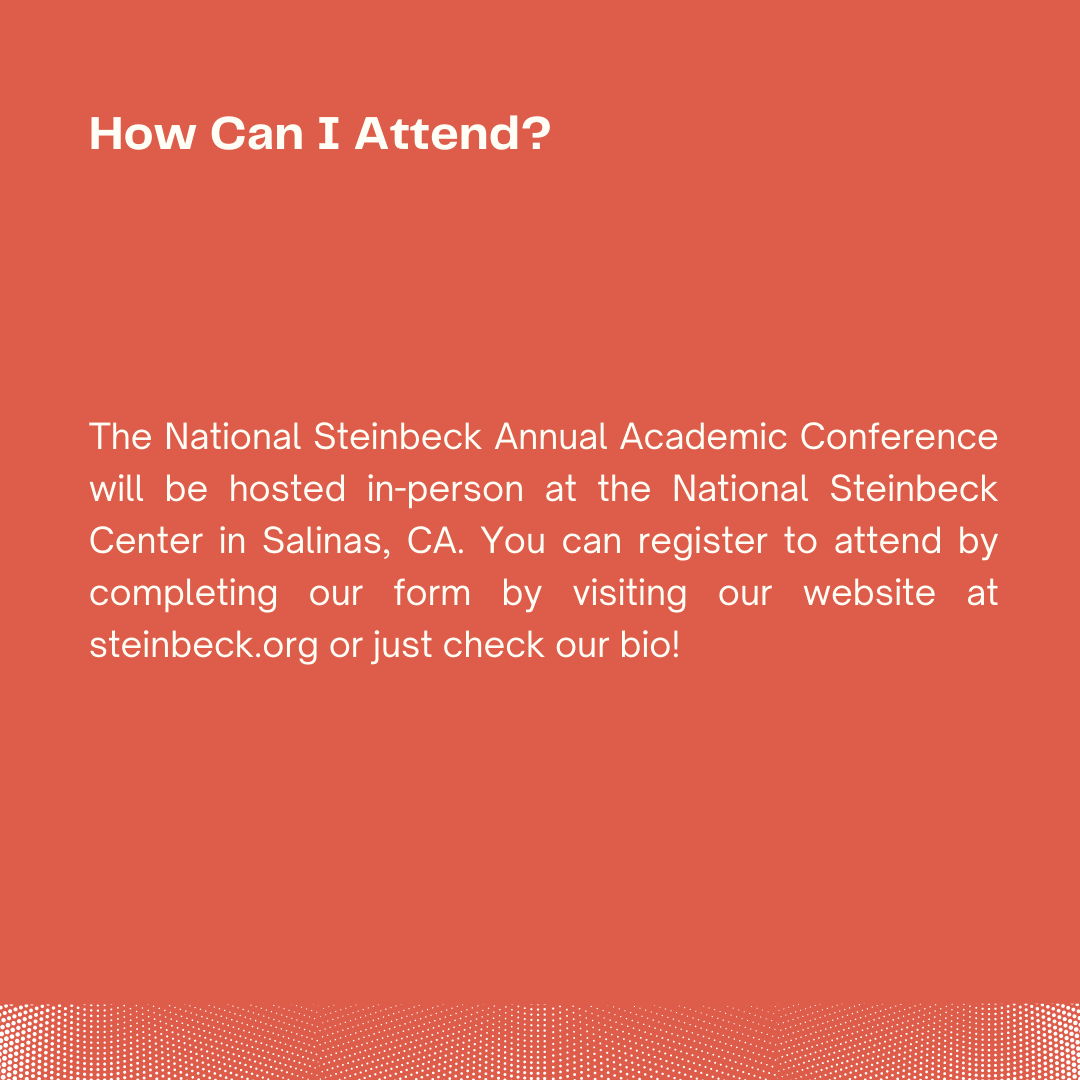
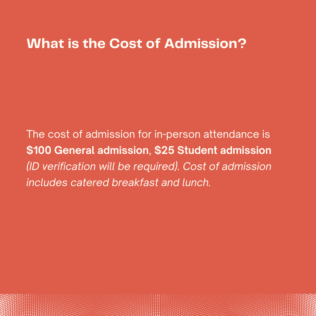
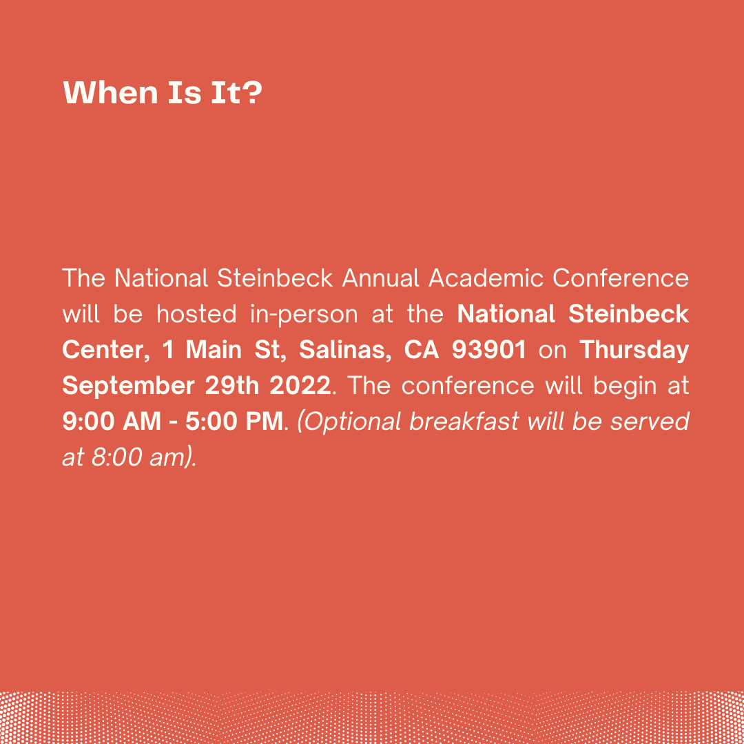
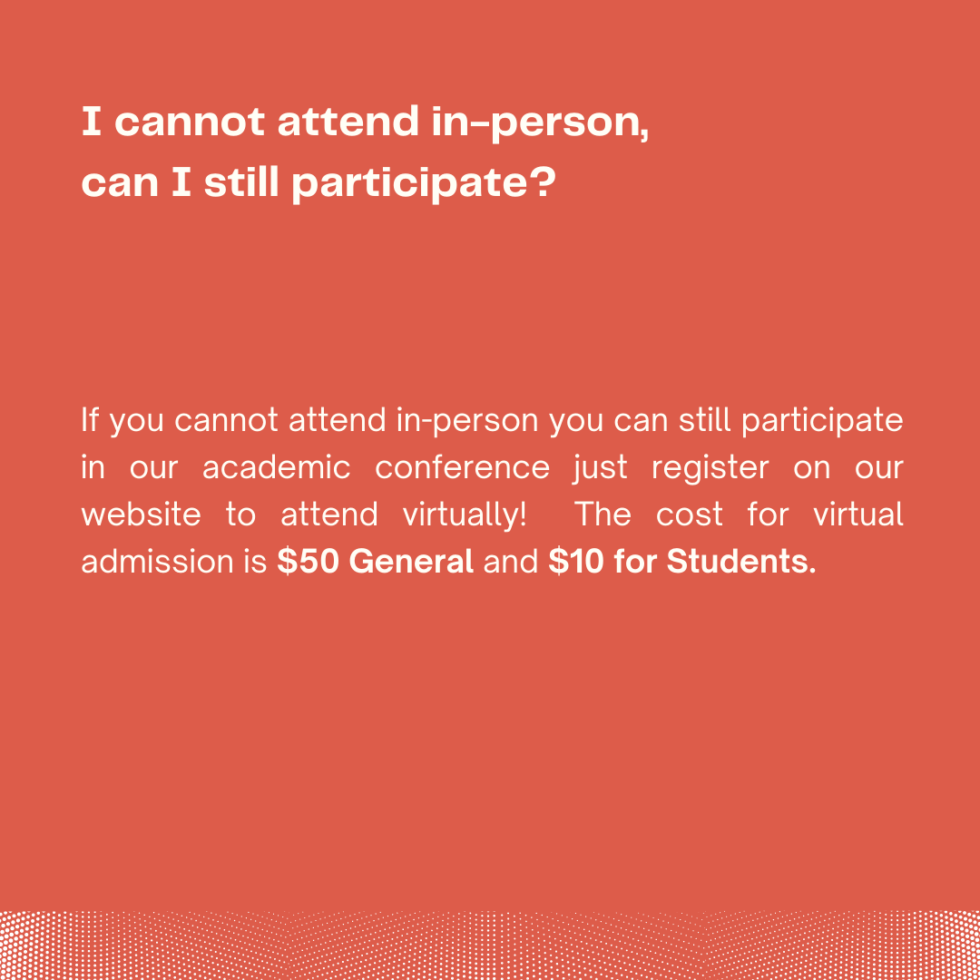
CONFERENCE FAQ's

PHASE 1 - RESEARCH + MARKETING STRATEGY
During the first month, I worked alongside my two fellow intern team members to develop a marketing strategy and local contact list to market the event to the public both online and in-person. I familiarized myself with the National Steinbeck Center by taking a tour to look through the center’s temporary/permanent exhibit displays and artifacts to better capture the center’s existing visual identity.

sourced from steinbeck.org

sourced from steinbeck.org

sourced from steinbeck.org

sourced from steinbeck.org

sourced from steinbeck.org

sourced from steinbeck.org

sourced from steinbeck.org

sourced from steinbeck.org
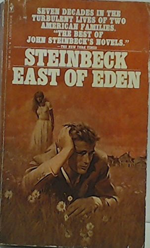
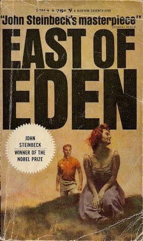
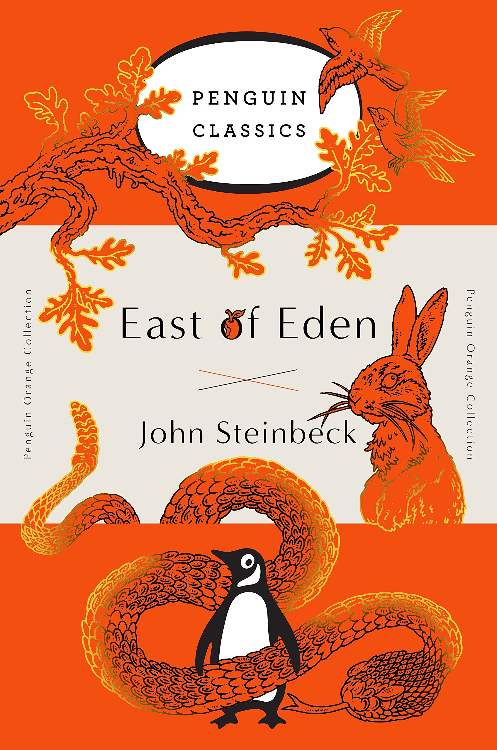
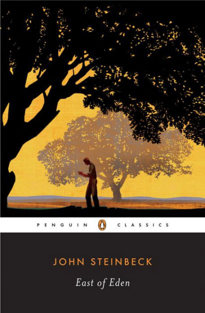
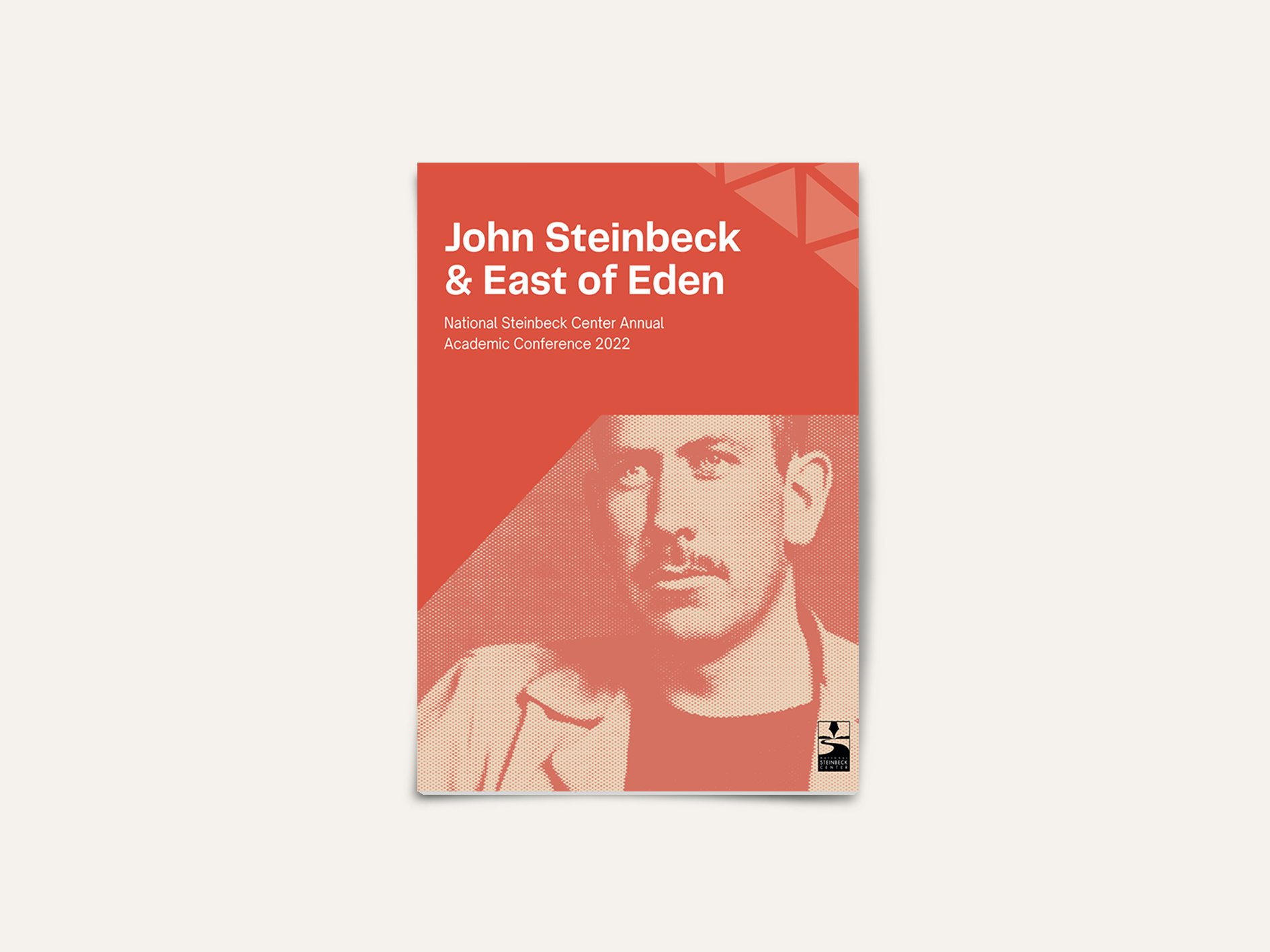
I referenced historical archive images of Steinbeck’s book East of Eden throughout history to take inspiration for the conference’s visual identity. The older published book covers had block text display for the title and texture overlay, while the newer printed editions by Penguin Classics incorporated red/orange hues.

PHASE 2 - VISUAL IDENTITY
I created 3 variations of possible images for the National Steinbeck Center's Board of Directors to review. After receiving feedback for the initial website image asset, we went in the first direction.
STYLE GUIDE
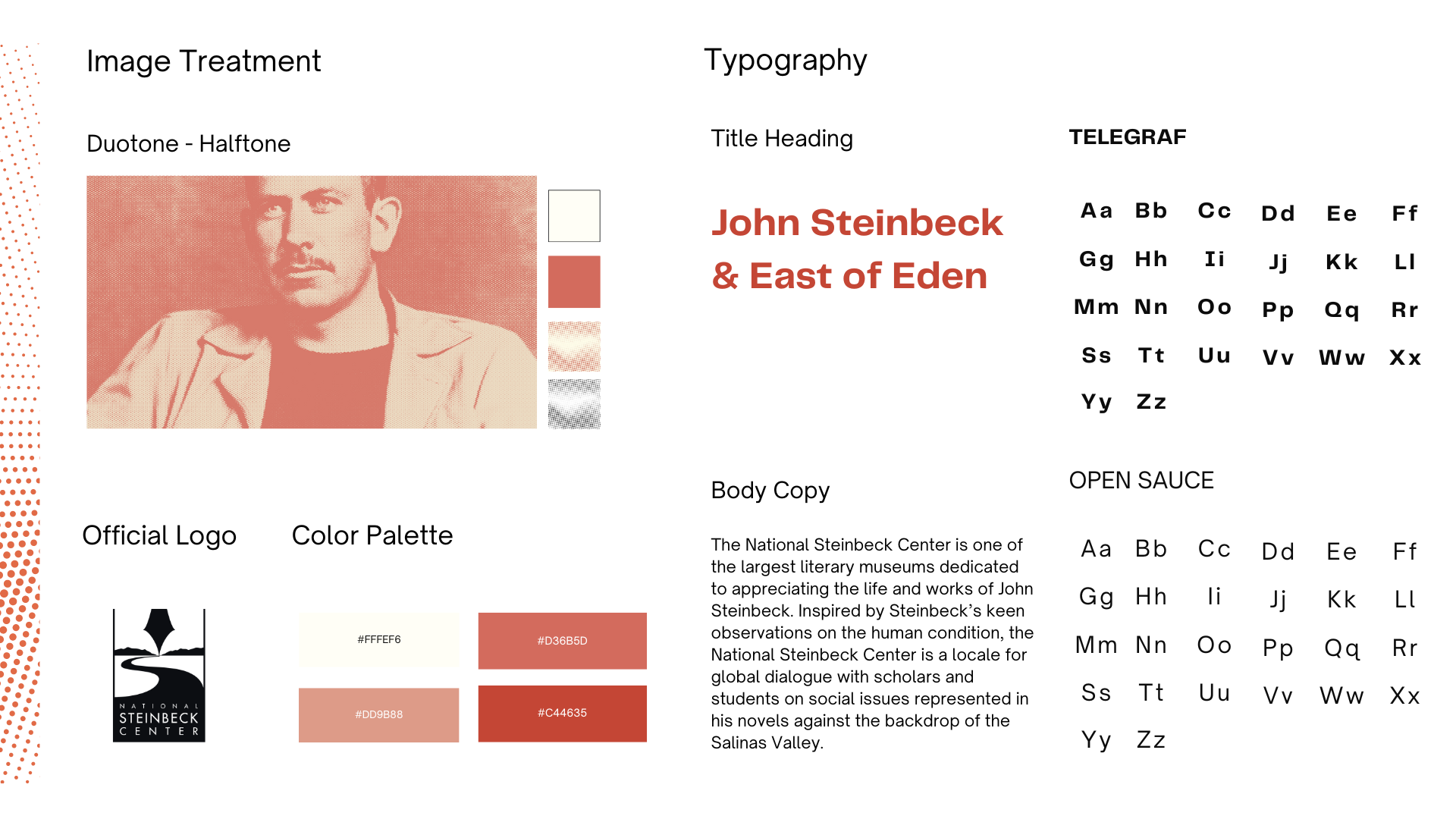
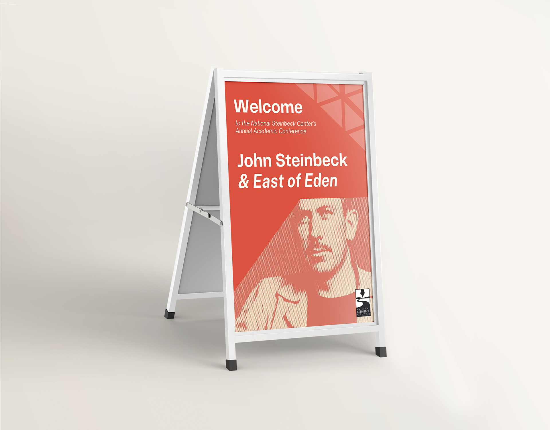
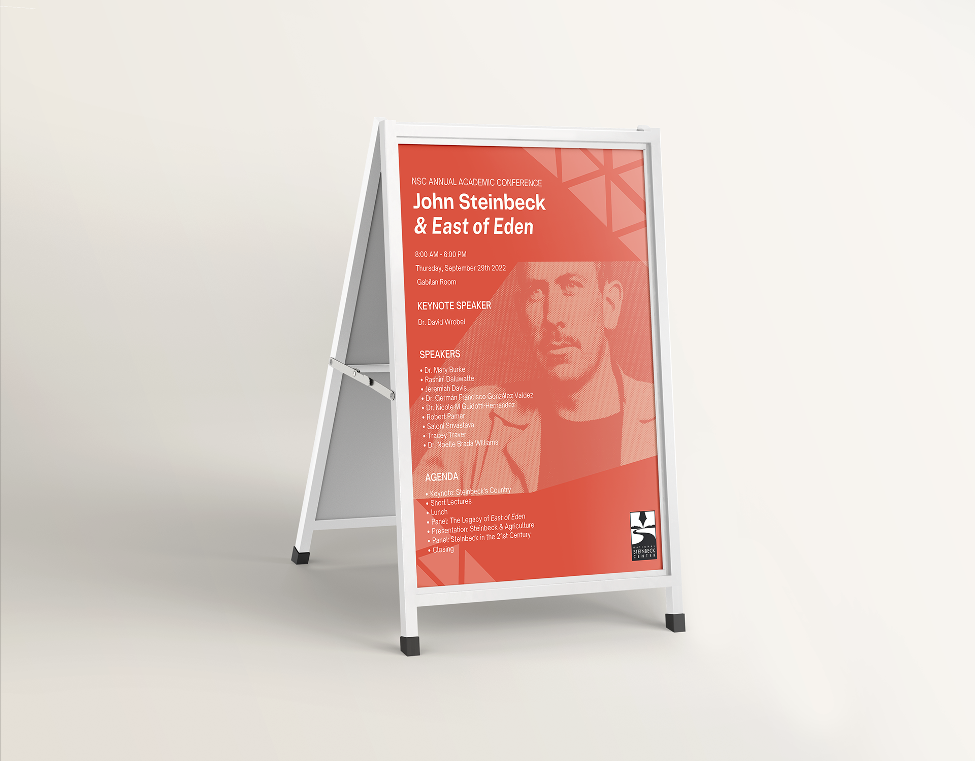
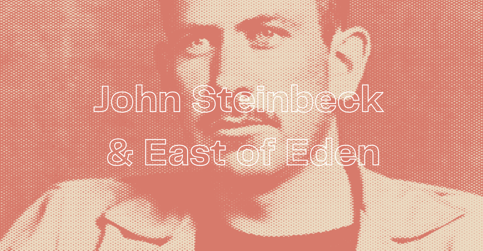
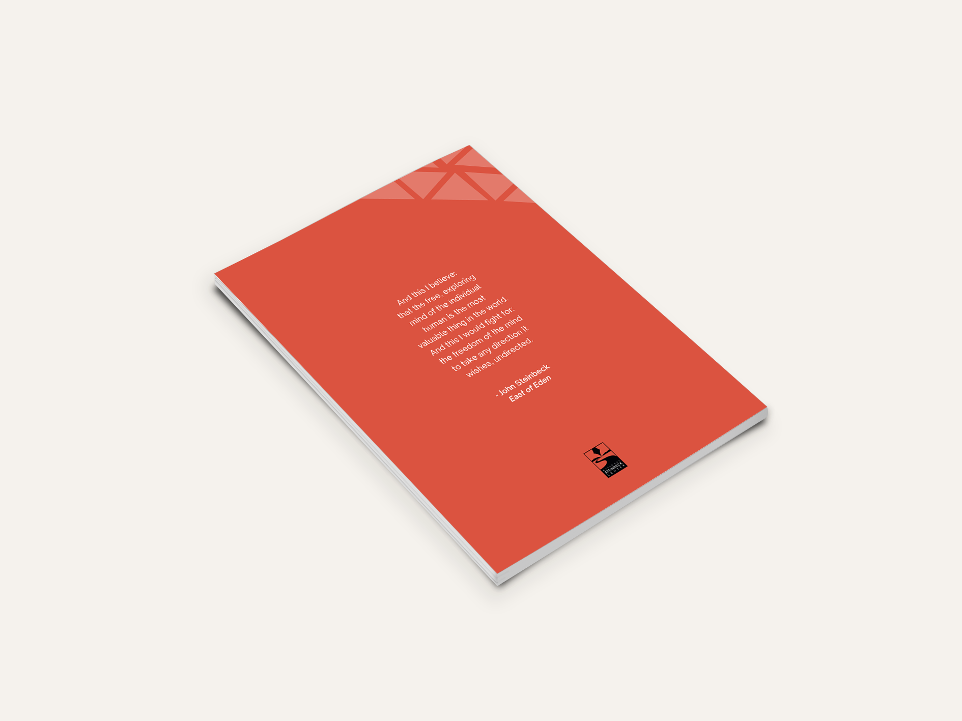
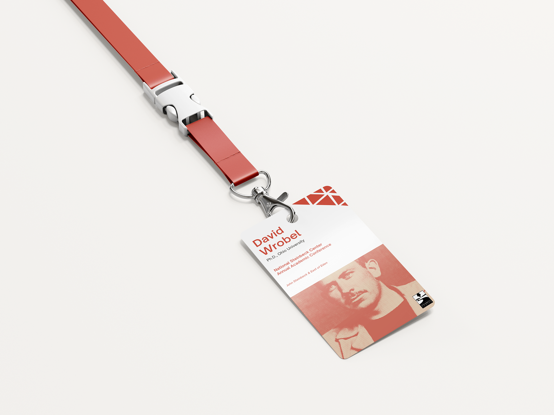
I began creating a comprehensive style guide for the conference’s deliverables to create consistency in the marketing materials. I added a halftone treatment to the image to replicate the vintage look from The Steinbeck Center’s archive images. We opted for a bold sans-serif typeface that echoed the design of earlier published book covers of East of Eden. To modernize the image, I added a duotone rosy, red color as a second image treatment to connect back to the present. I added the halftone and duotone treatment to all marketing materials to create consistency throughout the deliverables. The geometric shapes used are meant to symbolize the mountains within the novel.
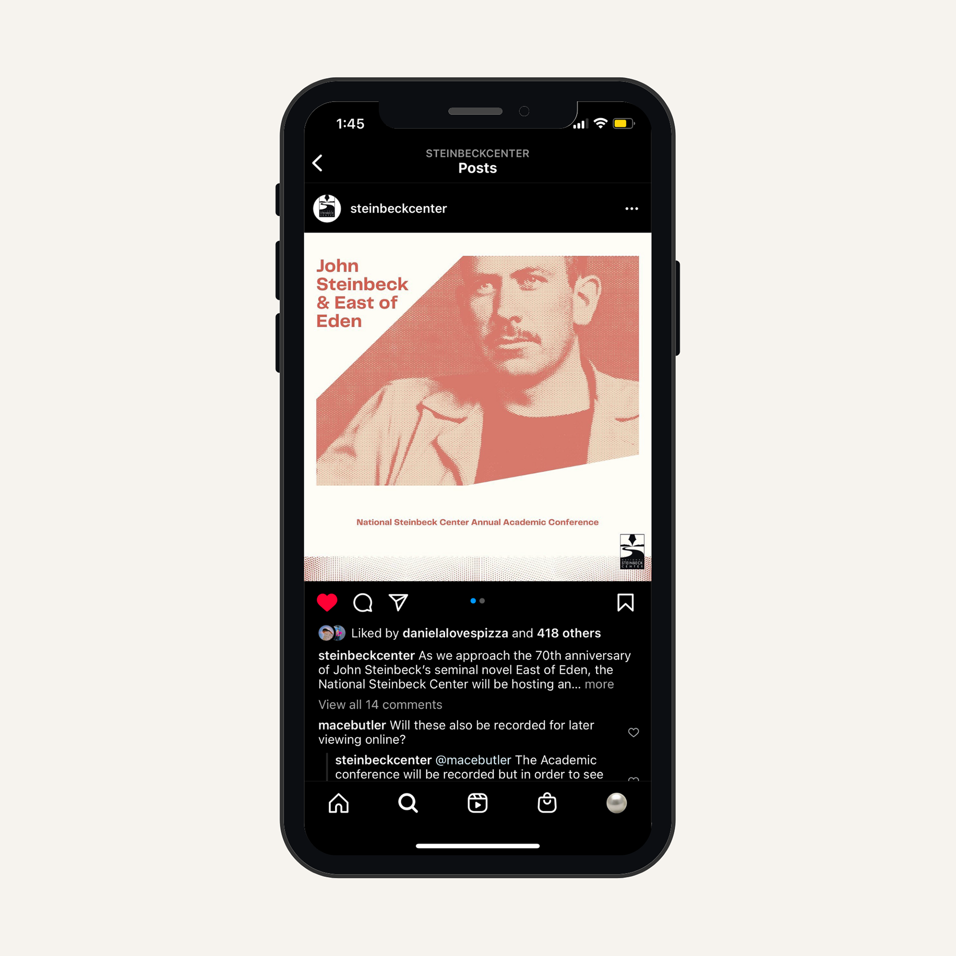
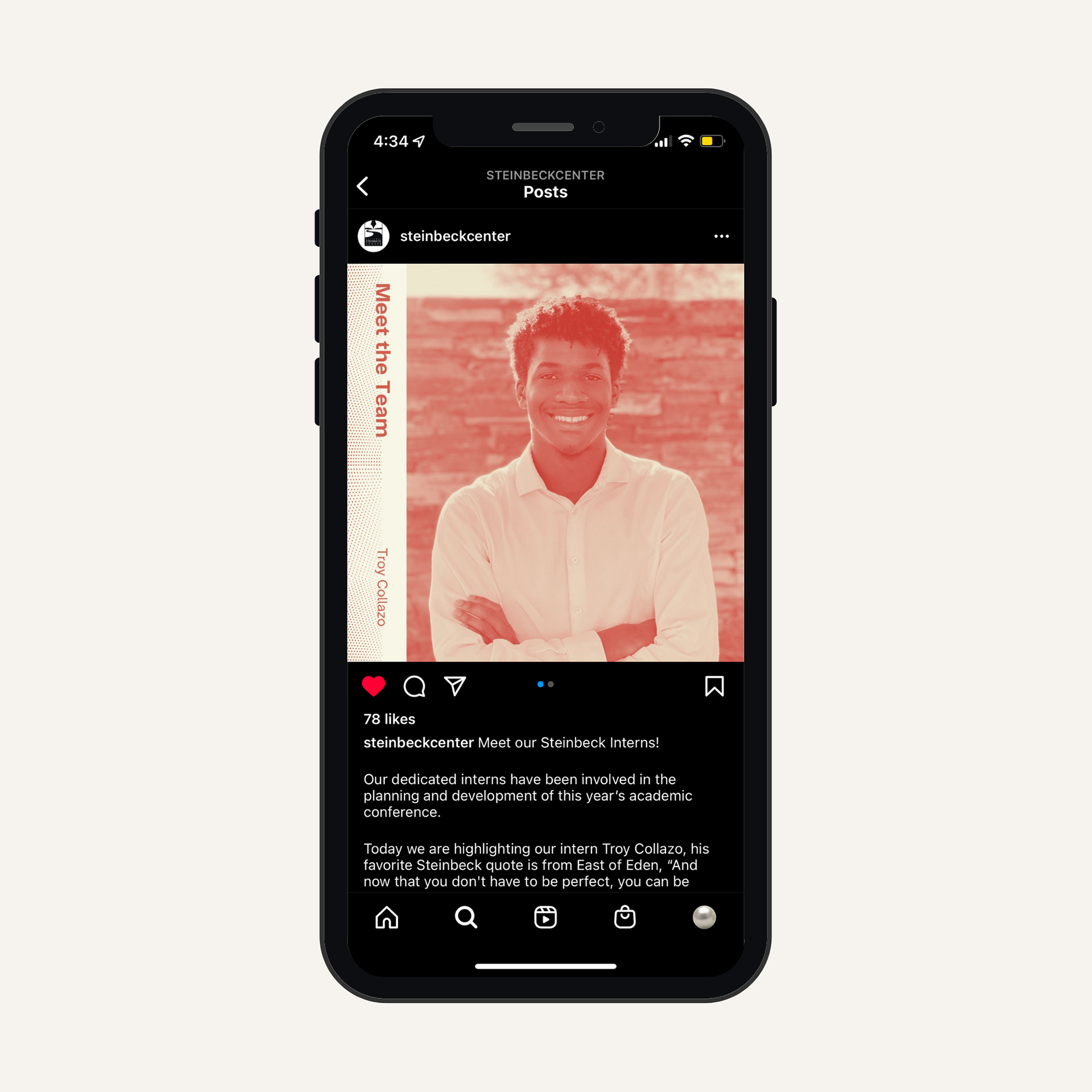
PHASE 3 - SOCIAL MEDIA ASSETS + DELIVERABLES
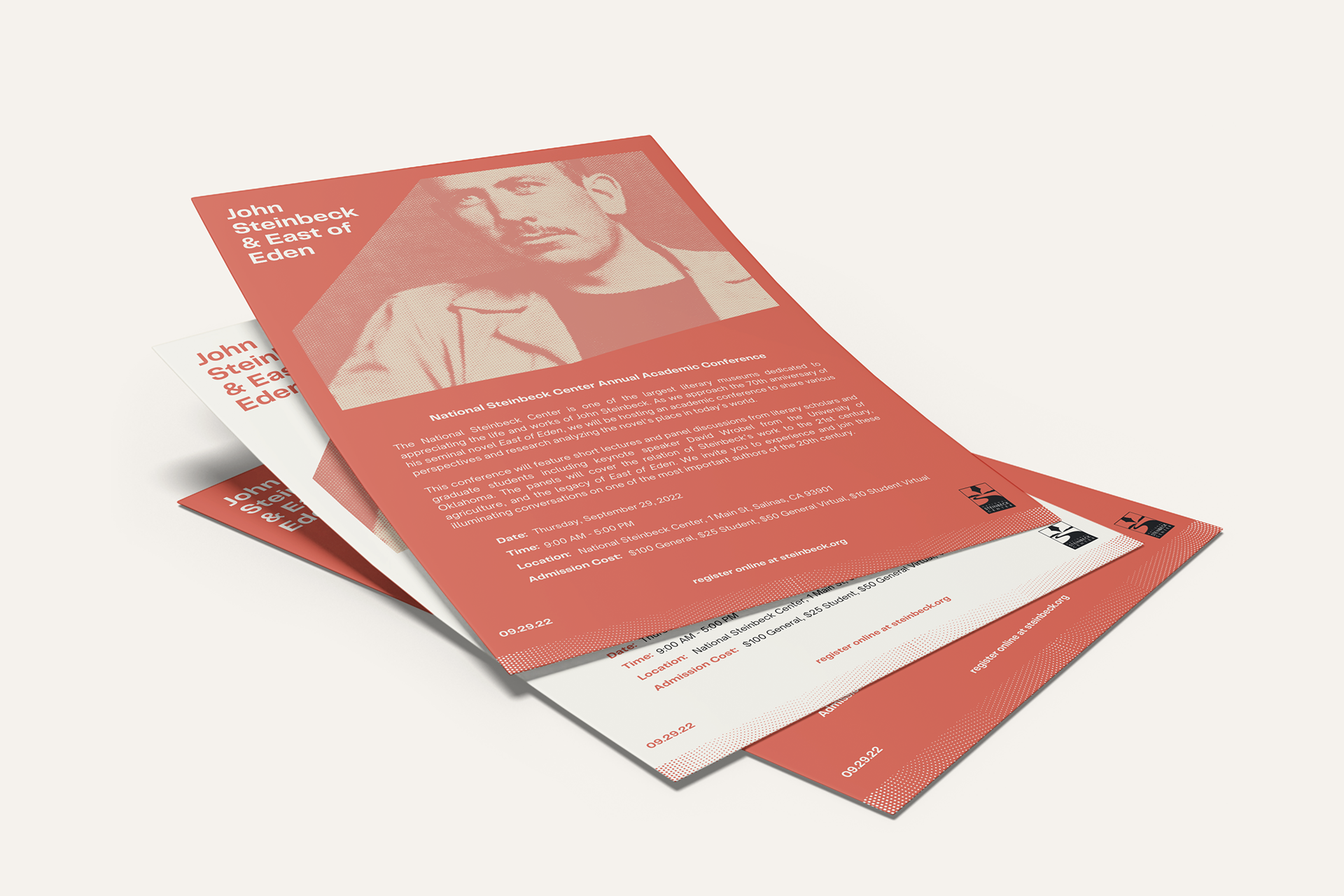
A4 FLYERS
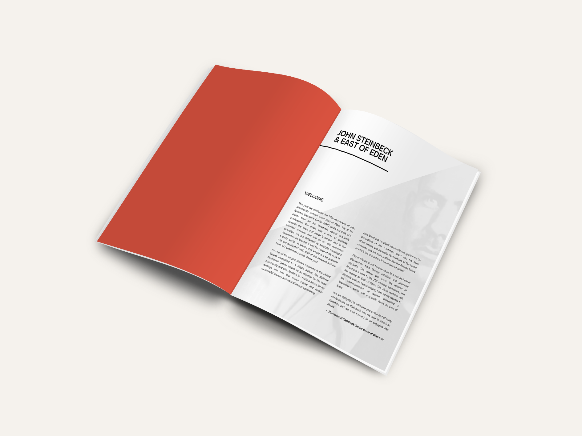
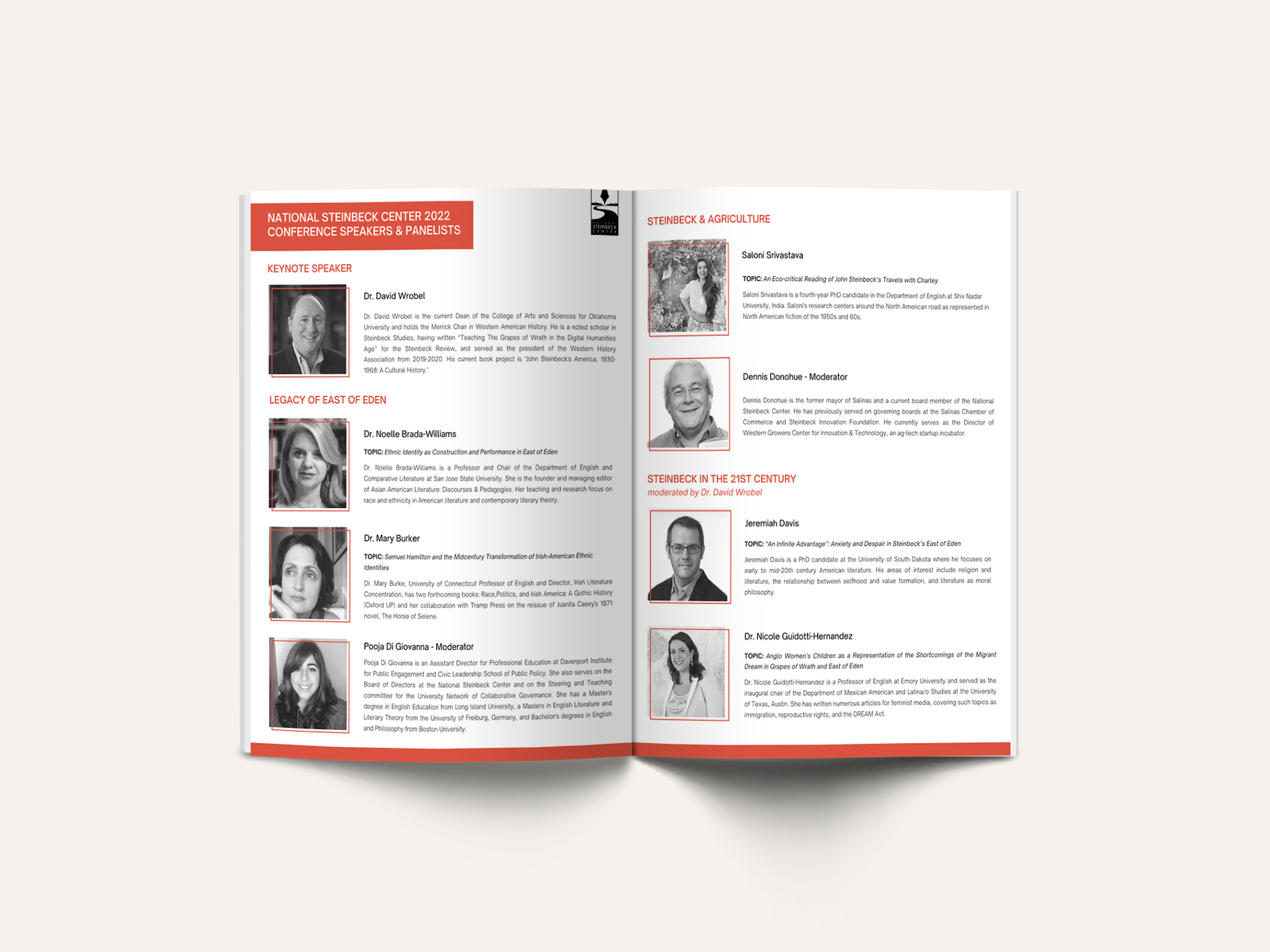
CONFERENCE BOOKLET
LANYARD BADGES
DISPLAY STANDS